Our Blog
This blog is to keep you entertained, informed, and educated on all we do!
…and the Winner Is… Red Carpet Worthy Picture Framing


The Academy Awards
The 94th Academy Awards will be televised on March 27th. The nominees for Best Picture are…
Belfast; Coda;
Don’t Look Up;
Drive My Car; Dune;
King Richard; Licorice Pizza;
Nightmare Alley;
The Power of the Dog;
West Side Story
—

Did You Know?
Each Oscar statue is gold plated, weighs 8.5 pounds, and costs $500 to produce. Academy Award winners have to sign an agreement stating that if they want to sell their statue, the Academy has first rights to buy it for only $1!


…AND THE WINNER IS…
Red Carpet Worthy Picture Framing
It’s award season! The Oscars might get all the attention right now, but our creative picture framing designs are a winner every time. Break out the champagne, dress to the nines, and keep scrolling to view our red carpet worthy projects.
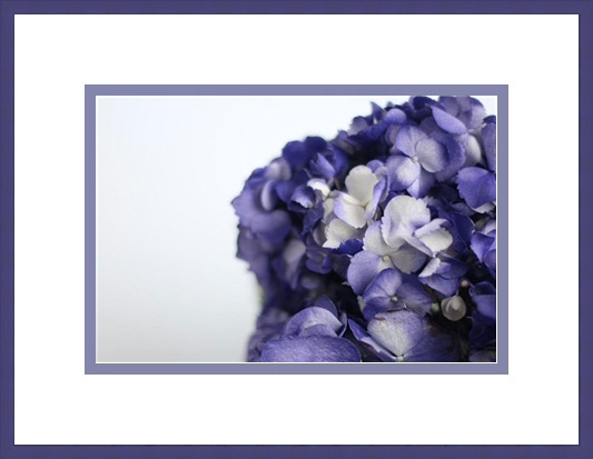
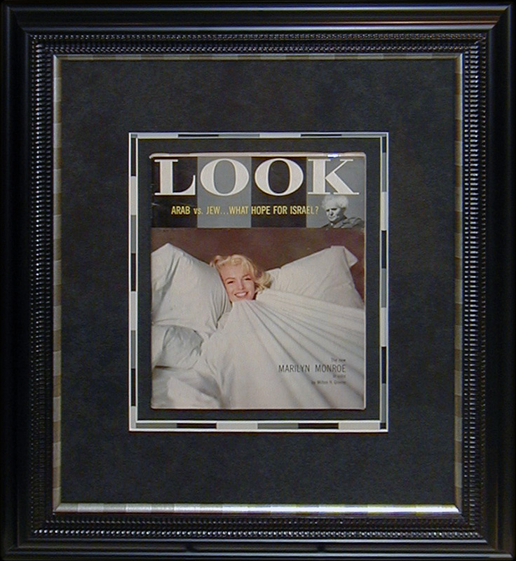 BEST MATTING:
Look magazine was published from 1946 to 1970; this issue featuring Marilyn Monroe is definitely a collector’s item worthy of framing. The Look logo has a black and gray background, so we used the same colors and pattern in the matting for a creative design.
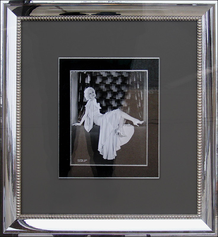
Although she was in 47 films, Jean Harlow never won an Oscar. Known as the Blonde Bombshell, she became one of Hollywood’s most enduring actresses despite a relatively short career. What frame is movie star worthy and works with a boudoir portrait like this one? A mirrored frame, of course.
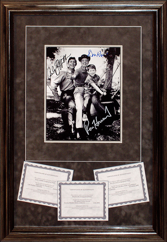
BEST TV Memory:
Several generations have grown up watching The Andy Griffith Show. It was nominated for an Emmy Award for Best Comedy Show three times but never won. We think this framing is a winner, though! This autographed photo from the show was framed with a rustic, vintage design to match the era and outdoorsy nature of the program.
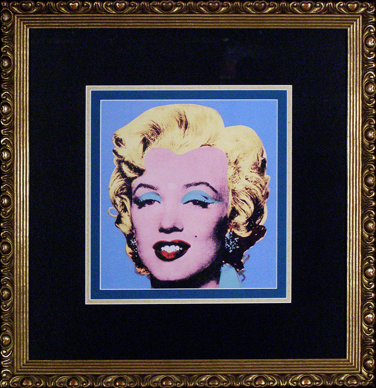 BEST Drama:
Andy Warhol painted Marilyn Monroe in the early 60’s and became known as a leader in the Pop Art movement. The bright usage of color in this silkscreen brings to life Marilyn Monroe’s iconic status and celebrity glamour. For our frame design, we wanted something bold and dramatic. Black never fails for drama, and the curvy gold frame emphasizes the curls in her hair.
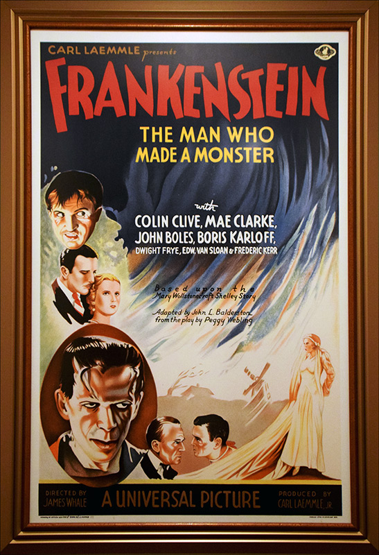
Movie posters are widely available these days but framing them doesn’t have to look generic or cheap. We wanted the framing of this Frankenstein movie poster to replicate the look and feel of the original 1931 classic. By stacking three golden frames together, we replicated the drama and glamour of 1930s Hollywood, the bygone era of the gilded movie theatre.
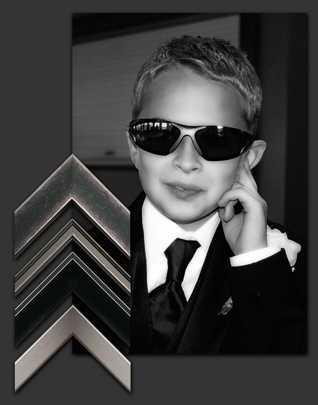
This little movie star deserves an award worthy frame! Turn the stars in your life (your kids, grandkids, parents, best friends…) into legends by framing a photo of them. Look through your favorite pictures, find the ones that have the most ‘Hollywood’ glam, and frame it to match that star’s personality. How would you frame this photograph?
Free Newsletter Offer:
Want to receive our blog content as soon as we release it? Fill in this Form for to receive it in our free monthly newsletter!
A Different Way to Frame
A DIFFERENT WAY!
“We mostly see what we have learned to expect to see.” – Betty Edwards
It’s always fun to see something in a different way – especially when you are framing a piece of art. Maybe the final design you decide upon wasn’t what you thought it would be. We love showing you the possibilities of how color, frames, and matting can change the look and feel of what you frame. There isn’t just one way to frame a treasure! Here are different ways to frame the same art.

BABY PORTRAIT: This darling cuddly baby deserves to be surrounded by a
frame that is warm and soft. The frames all share a delicate element, tying in
with the nature of the portrait. There is no need for matting because the blanket
in the portrait serves that visual purpose.

ABSTRACT LANDSCAPE: Abstract art naturally lends itself to a world of
possibilities. This focal point is obvious, but do you go with the neutral mat? Or
a mat the color of sunshine? Or the color of the mountains? How fun do you
want it to be?

RUSTIC HOME: Here’s a throwback look of a rugged house in the woods.
Because it has a subtle, serene feel, we didn’t get too crazy with the design. We
varied the mat colors just a bit. Which one works for you?

MOTHER AND DAUGHTER: Mother and daughter, is there anything more
special? A classic black mat was used to contrast with the lightness of the
portrait. So, the next question is what kind of frame? A striking bold silver, a
feminine antique, or a gentle silver with soft curves mimicking the waves in
their hair?


WEDDING PORTRAIT: The wedding portrait is timeless, but what style is best for you?
1. A soft black frame for a strong feel but doesn’t compete with the groom’s suit.
2. A traditional gold frame with soft curves for an elegant look.
3. A silver frame to soften the feel, yet still quite elegant.
4. A classic wood frame with black accents to tie it all together.
5. Or a pure white frame encircling the bride’s dress.


Do you know how many mat choices you have?
We have 1,644 to pick from!
• Fabric mats – linen, silk, burlap. These mats give your artwork different looks, from elegant to vintage to casual.
• Mats made to look suede for a rich, soft look. PS – they’re not really suede!
• Mats with different color cores (the beveled white line you see at the edge of a mat) offer a more personalized touch to the art. Cream for an antique look, black for a defining line, and colors for fun.
• ‘Rag’ mats when you want the very best. They are the best because they are made from 100% cotton. They have no properties that can harm the art.
• There are ‘Leather’ mats for a masculine or wild west look.
• Even sports mats that looks like pigskin or a golf ball – even TURF!!!


POMEGRANATE
PAINTING:
This lovely painting depicts ripe pomegranates harvested from the landscape in the background. Do you choose the lively silver frame with wood accents and curves that work with the pomegranates, or the gold/silver coloring to coordinate with your décor? Or a darker coloring for contrast? The choice is yours.
DIFFERENT can be AWESOME!!!!
You don’t want your framed art to look like everybody else’s. Come in today and let us show you the possibilities for your art.
Free Newsletter Offer:
Want to receive our blog content as soon as we release it? Fill in this Form for to receive it in our free monthly newsletter!
What we have been working on…
Two signed jerseys and some hockey cards!
What a difference CUSTOM framing makes eh? These items were dropped off by another client who entrusts us with our creativity. We made a special frame of the Team Canada Logo and merged it into the large one. Some custom printed matboard to match the jersey pattern (which is really cool) and a lot of Candian Red – oh ya – also a custom Gold Ice matboard as well – just to let everyone know they won the gold!!!
Here are a few pics of the progress and the FINAL RESULTS!!!
Enjoy the view…


Free Newsletter Offer:
Want to receive our blog content as soon as we release it? Fill in this Form for to receive it in our free monthly newsletter!
COLOR TRENDS 2022
COLOR TRENDS 2022
FRESH NEW YEAR FRESH COLOR PALETTE
For over 20 years Pantone has determined a ‘Color of the Year’ based on design trends, socio economic conditions and our global culture. This year, for the first time, a new color was created to reflect the challenging, changing times we are all going through. Drum roll, please…
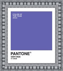
Introducing Very Peri!
How do you describe Very Peri? It’s a dynamic blue with violet-red undertones. Pantone describes it as blending the faithfulness and constancy of blue with the energy and excitement of red.
While Pantone concentrates on an all encompassing color trend, paint companies who determine ‘Colors of the Year’ use the same criteria geared towards home interiors. Playing on last years ‘calm me down and help me feel secure’ colors, it’s unanimous! Green is THE home décor color of 2022! Green is a calming color and represents regrowth. With that in mind, let’s look at colors the major paint companies say will be everywhere next year.

Guacamole by Glidden
Just like our favorite appetizer, Guacamole is relaxing and refreshing. It brings an organic energy to any space.

Olive Sprig by PPG
This is a crisp, earthy color that mimics nature’s resiliency and can blend into any environment.

Breezeway by Behr
Like a breath of fresh air, Breezeway is a cool, peaceful color tone that provides a feeling of renewal and healing.

Evergreen Fog by Sherwin-Williams
Combine green and gray with a hint of blue and you get a versatile and calming hue. It’s simple and sophisticated.

October Mist by Benjamin Moore
October Mist is a muted shade of sage green that can carry a look without drawing too much attention to itself.


What will your room be wearing this year?
Very Peri could be an overall color if you are bold enough, but it will probably work best as an accent color. Muted greens can work as understated wall colors or accents.

What Palette Do You Pair Well With?

You’re a down to earth, calm person who enjoys a relaxing vibe. This palette combines Behr’s Breezeway with Rainy Afternoon, Snowbound, and Ultra Pure White. Pair it with warm silvers and light woods for a modern, cozy space.
__

You’re an earthy, natural person and you like anything organic. This is a perfect palette for you. Sherwin Williams pairs Evergreen Fog with Neutral Ground, Dried Edamame, and Ethereal White. Top it off with light colored woods like Maple.
Try This Trick
When you are visiting Disneyland or Disney World, have you noticed the trashcans or fences? No? That’s because they are painted ‘Go Away Green’. This proprietary paint color is actually several different shades depending on the area and what they are trying to conceal. Want to hide unsightly items in your yard? Try these paint shades:

Free Newsletter Offer:
Want to receive our blog content as soon as we release it? Fill in this Form for to receive it in our free monthly newsletter!
Holiday Helpers from The Framing Nook Red Deer
HOLIDAY HELPERS
We Are Here To Help!
Do you need your art picked up?
Or delivered back to you?
Do you need it by December 25th?
Do you need your completed project gift-wrapped?
Do you need photos printed?
Do you need last-minute gift certificates?
Do you need a quick photo frame for a special snapshot?
Or a poster frame for a favorite movie?
Do you need holiday decorations?
Browse our shop for quick gifts…
Don’t forget about our specialty: an excellently designed and framed project!
How can we help you? Give us a jingle!
(www.framingnook.com 403 340-1575)


Holiday Hours &
Project Deadlines
Holiday Hours & Project Deadlines
The holidays are already here, and we don’t want your project to be late! Below are our holiday hours so that you can give your gift on Christmas Day!
M F 9 5:30 Sat 10 4
We will be framing up to December 23 but don’t wait any longer contact us now!
We will be framing shadowboxes up to Dec 15 but it will be limited!!!
We will be accepting new holiday framing projects until Dec 20 BUT really? why wait?!

Thank You from all of us at The Framing Nook!
Thank You for your Patronage
Because of you we were able to donate to many local charities this year!
Free Newsletter Offer:
Want to receive our blog content as soon as we release it? Fill in this Form for to receive it in our free monthly newsletter!
What we have been working on…
A special Time for a Special Person…
It was a very special time for a very special person…and that meant keepsaking the memories so the thrill can be remembered each and every day!
Smiles abound as our client’s son was able to meet Mayor Veer and be involved in the Canada Winter Games a few years ago! Glad we could play a small part in the memories!


Free Newsletter Offer:
Want to receive our blog content as soon as we release it? Fill in this Form for to receive it in our free monthly newsletter!
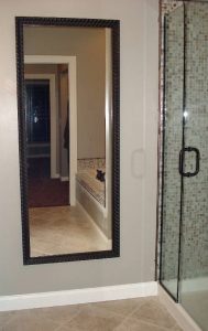
Add Glam with Mirrors

Add Glam with Mirrors
Create Drama, Style, and Space!
Are you hosting a holiday party and need to dress up your décor? Do you want to add some drama to a non-descript space or room? That’s easy – add a mirror custom framed with a touch of glamour!

 Mirrors & Space
 Mirrors & Space
A floor to (almost) ceiling mirror can make a room look taller. If you place a mirror at the end of a hall, the hall will appear longer. Placed in an entry, the mirror can visually double the space. Mirrors creating space work especially well in small rooms such as dressing rooms and bathrooms.
Mirrors & Size
 One of the biggest mistakes when creating a mirror is going too small! A mirror needs to be large enough to…
Reflect your face (and perhaps outfit)
Reflect a scene or a view
Bring in light
Make a statement
Small mirrors work when you are framing several smaller mirrors together to hang as a grouping – more of a decorative look. If we are building this mirror for you, it will be the exact size you need it to be.
 Tip:
Tip:
 Tip:
Tip:Is this new mirror going above the mantel? It needs to be the same width as the mantel or just a few inches smaller on each side. Cover at least two-thirds of the space. To make a ceiling feel higher, be generous with the height of the mirror.
 Mirrors & Light
 Mirrors & Light
Looking for a natural way to add light to your room? A mirror can do that! Place the mirror where the light naturally falls in a particular room to increase illumination. Another trick is placing the mirror adjacent to a window (opposed to opposite it). Voila! More light! What about rooms that have few or no windows, like a dressing room or an entry? Place a lamp or sconce adjacent to or in front of the mirror to double its lighting effect. For a glamour, hang a chandelier, but keep the wattage down for mood lighting. Remember, the larger the mirror, the more light you see!

Holiday Hours &
Project Schedule
The holidays are already here, and we don’t want your project to be late! Here are our holiday hours so that you can give your gift on
Christmas Day!
M-F 9:00am – 5:30pm
Saturdays 10am – 4pm
Please Note!
We highly recommend you come in as soon as possible to get your custom framing done this year!
We are seeing a lot more delays in getting materials as well as back-orders.
Please give us as much advance time so we can get those
AWESOME GIFTS
done in awesome fashion!


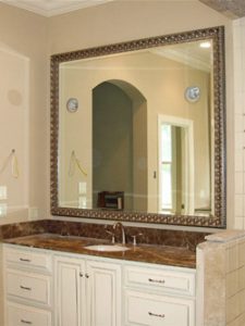
Mirrors & Frames
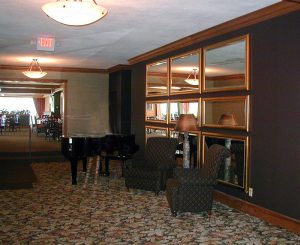
When choosing a frame for a glamourous look, the tendency is to go toward silver or metallic frames, similar to the ‘Hollywood Glam’ style. In this example, three frames were used to create complexity and the beveled edge adds to the drama.
Silver has long been the choice for a glamour look, but don’t rule out darker coloring. This mirror was framed using a deep brown frame with rich gold edging. Nothing says ‘Look at me’ more than gold!
A dressing room or bathroom is the perfect place to add glam and to show off the beautiful you! This mirror was framed with a pink-hued gold to blend with the other pink tones in the décor. When you walk in this bathroom, all you see is what’s in the mirror, beautifully framed.
Mirrors & Hanging
- A mirror needs to be hung so that it gives the best reflection. Is it in a hallway or entry? Hang it at eye-height so that you can check yourself as you pass it.
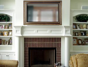
- In a living space, it is dependent on where it will be hung. If it is above a fireplace mantle, generally, not more than 12” above the mantel. If it is going behind a sofa, don’t hang so high that there is a disconnect between the two. Create a group feel.
- Lastly, think about what it will be reflecting. If it is opposite a blank wall, hang a piece of art so that the mirror reflects that. If it is the beautiful mountain view outside, hang the mirror at a height that shows the whole view. Depending on what a mirror reflects, it can become a work of art in itself.
- Looking for glamour with a kick? Frame several small mirrors in different frames and hang as a group.


How to Create a Glamourous Mirror
- Determine which room(s) need a mirror.
- Do you need more light? More space? More glamour?
- Take a picture of the space; Measure the space.
- Take additional pictures of the room décor.
- Come to us – we’ll help you design the perfect mirror, with the exact measurements.
- We’ll even install it for you!
Small Business Saturday
Small businesses are at the core of every successful neighborhood, and because of these unprecedented times, now more than ever local businesses need your support.
Shop small!

Delivery & Installation
Mirrors are big and heavy. They can be tricky to hang properly to support the weight. We would love to hang your new mirror for you.
Ask us for more details.
Free Newsletter Offer:
Want to receive our blog content as soon as we release it? Fill in this Form for to receive it in our free monthly newsletter!
WHAT’S WRONG HERE?
How to Correct Common Framing Issues!
Do you ever wonder why some framed art is easy to look at, and some makes you want to move past it quickly? It could be the art itself – maybe you don’t care for the style or subject matter, like abstracts or landscapes – but maybe it’s because of the way it’s framed. Yes, the framing design makes a huge difference!
We’ve framed 4 pieces of art (each with 2 mats and 1 frame) in 2 different ways so you can see how the framing impacts the visual presentation. Let’s take a look.

Serenity in the Guest Room
This serene, peaceful image is perfect for your guest room, which has green accents and oak furniture. The top mat should be green to match, right? And the frame should match the furniture?
Not necessarily.
Neutral colors sourced from the photograph (and not your walls) will let the art shine, as well as blend with your current décor. By matting it just a shade darker than the light on the water, we avoid competition with the focal point. The frame continues the soft, neutral vibe, making it easier and more peaceful to get lost in the serene view.


Family Photograph
There is no better reason for a family portrait than an addition to the family! Wouldn’t it be cute to use the baby’s outfit for the mat colors and a brown frame to match those darling curls?
Maybe, maybe not.
If it’s the baby you really want to see and not the frame design, make your eye go right to the focal point. This can be done by letting the bold color of the outfit stand out on its own instead of competing with the framing. In this case, a soft white doesn’t interfere with the blue outfit, taking your eye straight to the baby and the parents’ delighted faces.


Pink Flamingos
You could watch flamingos all day long, so you found art that lets you do just that. Of course, you want the flamingos to be what you see first when you look at it, so the best thing to do is neutralize it with a white mat, right? And the pink frame is a play on the flamingo color! Great idea….or is it?
In this situation, the white mat contrasts with the pink, so pink is what you see – not the flamingo, just the frame. The white mat is stark – it creates a strong outline around a fairly dark image. Instead, pull the colors from the background, leaving the focal colors alone. Are the flamingos easier to look at now?
Abstract Art
Abstract art is versatile and can frequently go with any décor because the design is usually non-specific. Abstracts can create a soothing feeling or add a splash of color to a space. Because abstract art sometimes has a lot going on, it’s best to give it space, or it can look confusing.
This colorful example was designed with the same 2 mats and frame, but with different matting proportions. The first appears cramped and overwhelmed, forcing your eye to the framing instead of the art. The second is easier on the eyes, with ‘breathing room’ for the art. Which would you rather look at?


Rules of Thumb for Framing Design
 Stick to colors that are in the artThe mat color should not be lighter or darker than any color in the artContrast the top mat with the focal point
 Vary the widths of the design package components

Free Newsletter Offer:
Want to receive our blog content as soon as we release it? Fill in this Form for to receive it in our free monthly newsletter!
ABC’s of Framing!
THE ABC’S OF FRAMING The More You Know…
When you are at a frame shop, do you hear terms you aren’t familiar with? Does it sometimes feel like a foreign language? We’ll take you back to school – grab a pen & paper and let’s begin!


A is for ART –
The reason and foundation for framing
B is for BALANCE –
Various art & framing components working together
C is for CONSERVATION –
Making sure no materials are used to harm your art
D is for DESIGN –
It must be pleasing to the eye!
E is for ELATED! –
How you feel when you receive your completed project
F is for FRAME –
It holds it all together
G is for GLAZING –
Glass or acrylic protection from dust, bugs and harmful UV light
H is for HANGING –
Let us do it – we’re the professionals!
I is for INSPIRATION –
What our designers can do for you!
J is for JOINING –
Attaching the cut moulding together to become a frame
K is for KEEPSAKE –
A special memento fit for framing
L is for LIGHTING –
You want to see the art, so illuminate it!
M is for MAT –
To keep the glazing off your art and make it look pretty!

N is for NON-GLARE –
Glazing that has a reduced reflection for enhanced visibility
O is for OPEN! –
M-F 9-5:30
P is for PICK-UP –
You can come in to pickup your framed work or we also offer a delivery service!
Q is for QUALITY –
It’s what we build. We want your project to last forever – guaranteed!
R is for RELATIONSHIP –
Nothing is more important to us than building one with you
S is for SHADOWBOX –
A deep frame for 3D objects
T is for TAPE –
Special framer’s tape holds fine art in place without damage
U is for ULTRAVIOLET –
Rays that can harm art. Use UV-filtering glazing for protection
V is for VIRTUAL –
You can browse what we have done for many others and get some really great ideas from our gallery collection online at framingnook.com
W is for WOOD –
What our frames are made from – NO PLASTICS here!
X is for XCellence–
We strive for it in all we do!
Y is for YELLOWING –
Discoloration that can happen when acidic materials touch your art
Z is for Z-BAR –
The best hangers to use when hanging heavy or large pieces
Now you know your ABCs!
How many terms did you know?
Most of them are familiar, but if you knew all 26 – you must be a framer!
If you knew 15, you’ve had several pieces framed OR you listen to us when we talk.
If you knew 5, we need to see you more often – Stop in today!

Dress Up Your Chalkboard
A chalkboard: The old school way of communicating. Still a great way to capture notes. Here is an elegantly framed chalkboard worthy of the classroom’s attention. Dress up your chalkboard with a custom frame!

Free Newsletter Offer:
Want to receive our blog content as soon as we release it? Fill in this Form for to receive it in our free monthly newsletter!
What we have been working on…
A father to remember!!
As much as Arlene and others will miss her father, she will certainly remember and take value from his qualities, and enjoy this tribute to him on her wall. We put together this job without the client coming into our store, working with her over the phone and via email to learn about him and what would go well in this memory piece. Being a true Canadian outdoorsman and creation-care-full person, we incorporated lots of nature in the photo, natural colours in the matting, weathered maple-leafs and some precious gold in the “Goodly Heritage” caption. Till you meet again, Arlene and family and friends!


Free Newsletter Offer:
Want to receive our blog content as soon as we release it? Fill in this Form for to receive it in our free monthly newsletter!

Quick Links
Visit Us Today
1 - 4664 Riverside Drive, Red Deer, Alberta, Canada, T4N 6Y5
Click On Map to Zoom In
