enthusiasm or vigor; vivaciousness; liveliness; spirit
PANTONE 18-1750
FUN FACT:
The origins of the magenta shade can be traced back to the cochineal beetle, which produces red carmine dye, one of the most precious natural dyes. Image credit: Huge / Pantone
Art & Colour Consultations
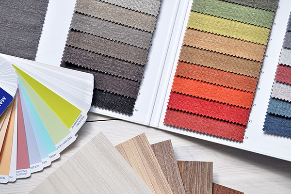
Do you want advice on how to use colour in your home? It can be overwhelming to put a colour scheme together. We can help! Our design experts will help you pick out colours that match your space and style. We offer in home design consultations at your convenience. Call, come in, or email us to schedule an appointment
Using Viva Magenta in Your Home
Many of us have neutral coloured walls and furniture. It is safe, but sometimes can be a bit boring. Make a stand out statement with Viva Magenta! Neutral spaces often beg for a focal point something as simple as changing out sofa pillows with magenta ones might do the trick. What about a fabulous piece of magenta coloured art? Or a colourful chair? Or a floral arrangement? Or will you be daring and paint a single wall Viva Magenta for a dramatic look?
Last year greens were the IT colour, and many of us embraced them; they were a soft, soothing shade. Red and Green are complementary colours, so try pairing Viva Magenta with Valspar’s colour of the year, Green Trellis. The result will be a calm vibe, mixed with an energetic pop. Add polished silver hardware or frame and you’re set!
How are you going to use these colours this year??
We Can Help!
Colour Trends by the Century
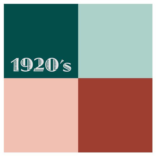
1920’s
The Roaring 20’s were a decade of indulgence. The walls were neutrals and accents were bright.
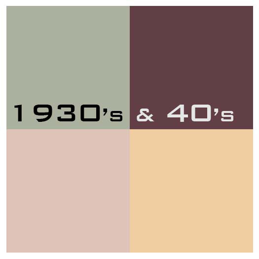
1930’s & 40’s
Smoky, dusty colours were the norm. Soft, subdued yellows, pinks, and hazy greens were accented with deep colours.
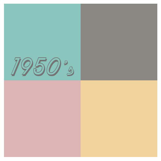
1950’s
Pastels ruled. They were even incorporated into appliances and bathroom fixtures.
1960’s
The ‘Peace, Love & Rock n’ Roll’ decade brought bright, clashing colours. Black & white were used to neutralize them.
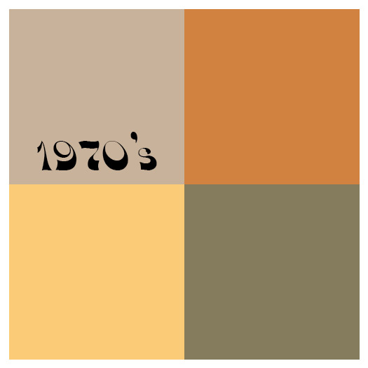
1970’s
Earthy colours dominate. Beige, rust, avocado, and harvest gold play together for a decade.
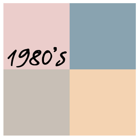
1980’s
Miami Vice and ‘country’ come together with mauves and blues. I bet you know a house that is decorated in those colours.
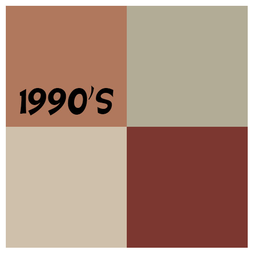
1990’s
A new take on earthy colours with a deeper, richer feel and Tuscan influences. Beige dominates, followed with terra cotta, sage and earthy reds.
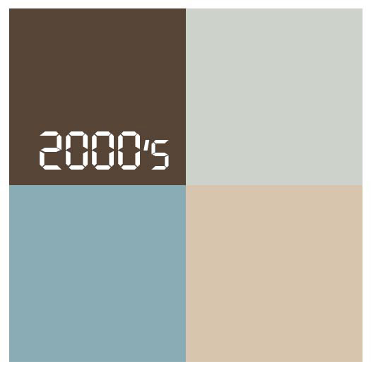
2000’s
Soft & Relaxing colours are popular to create a spa or coastal vacation feel in everyday life accentuated with pale blue and aqua paired with beige and white.
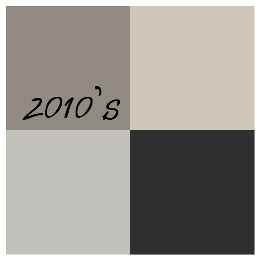
2010’s
Gray and any version of it is king! With the tech generation in full swing, gray was everywhere; paint, furniture, flooring, appliances, fixtures and, of course, laptops.
2020’s
Care to guess?????
Of all the amazing Colour Trends for the last 100 years…. ….which decade do you like best?
Free Newsletter Offer:
icon_truck Want to receive our blog content as soon as we release it? Fill in this Form for to receive it in our free monthly newsletter!
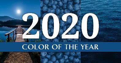
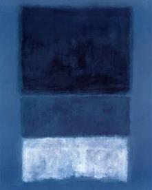
Blue is on the cool spectrum, so it has a calming feeling. This particular shade of blue represents dependability, trustworthiness, credibility and constancy. Classic Blue is a color you can relate to in this crazy, fast-paced and high-stress world in which we live. “This enduring blue highlights our desire for a dependable and stable foundation on which to build as we cross the threshold into a new era.”
In-Home Color & Art Consultations
Want more advice on how to use color in your home? It can be overwhelming to put a color scheme together. We can help! Our design experts will help you pick out colors that match your space and style. Call us today.
Naval by Sherwin-Williams
Pantone wasn’t the only company who tagged blue as a trending color. Look at Naval #6244 by Sherwin-Williams. According to Sherwin-Williams, “We’re predicting that the next decade in color is going to be bold. Naval merges the desire for rich, inspiring color with our yearning for relaxation and retreat.”
Chinese Porcelain by PPG
Chinese Porcelain #PPG1160-6 by PPG is a lovely blend of cobalt and ink blue. “The shade of blue instills calmness, reduces anxiety, and encourages sleep. This soothing blue imparts slowness, encouraging consumers to practice mindfulness and be more present in their lives.”
THE NEW NEUTRALS
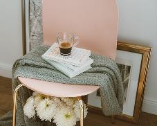
When you think of neutral colors, what comes to mind? White? Ivory? Tan? Not anymore. In 2020, the ‘new neutrals’ are pale shades of pink and grays. Interior designers are predicting that in the next 10 years, we’ll move away from non-descript neutrals, gravitating toward a more personal feel.
First Light by Benjamin Moore
First Light #2102-70 by Benjamin Moore reflects a shift in the mindset to a stronger sense for community, comfort, security and optimism.
Bombay Pink by Valspar
Look for new colorful neutrals like Bombay Pink #1006-8B by Valspar to add personality and elegance while remaining comfortable.
Romance for HGTV Home by Sherwin-Williams
Romance #6323 for HGTV Home by Sherwin-Williams will welcome you in with open arms. It pairs beautifully with bold shades to energize a room.
PUT IT ALL TOGETHER
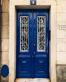
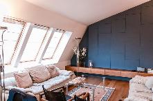
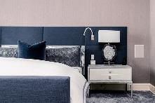
What does color mean to you? And how do you use these color trends in your framing & decor? While the blues are the right color for right now, you probably won’t paint an entire room in that shade. Try soft pink-grey backgrounds with a bold blue accent. Accent pieces can be a partial wall, a piece of furniture, your throw pillows, or – for a splash of curb appeal – the front door. On a smaller scale, you could hang a piece of classic blue art on a soft pink wall or frame a neutral art piece in a deep blue frame. Classic Blue has a lot of flexibility in the color palette combinations you can use!
Did You Know?
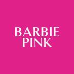
Certain Pantone colors are trademarked. These colors usually are made specifically for well-known brands, such as Target, Tiffany & Mattel (Barbie) ….
Pantone History
Did you know that Pantone began as a printing company? In 1963, an employee, Lawrence Herbert, developed a system for color printing consistency. He later purchased the company and renamed it to Pantone, which began publishing their Color of the Year in 1999.
Want to Receive all of our newsletters for information on framing, what we are working on and special deals just for you??? Just fill in the form below & we will add your name to our list – (WE DO NOT GIVE THIS INFO TO ANYONE ELSE FOR THEIR USE):