What we have been working on…

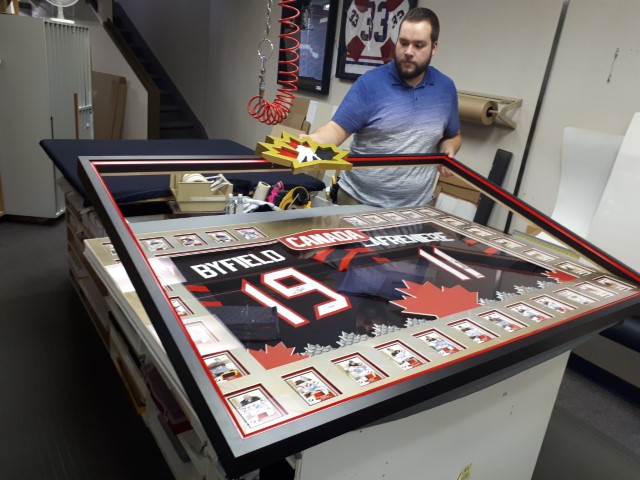
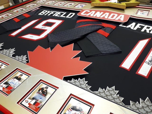
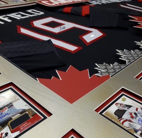
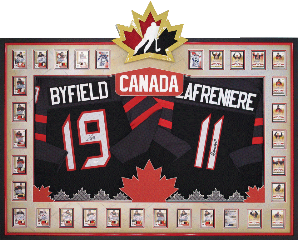
Two signed jerseys and some hockey cards!


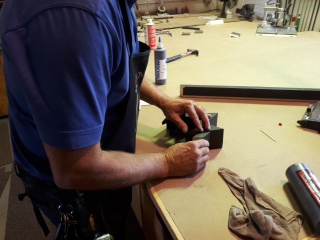
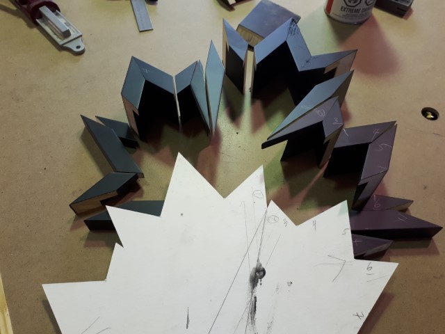
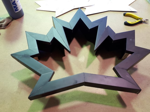
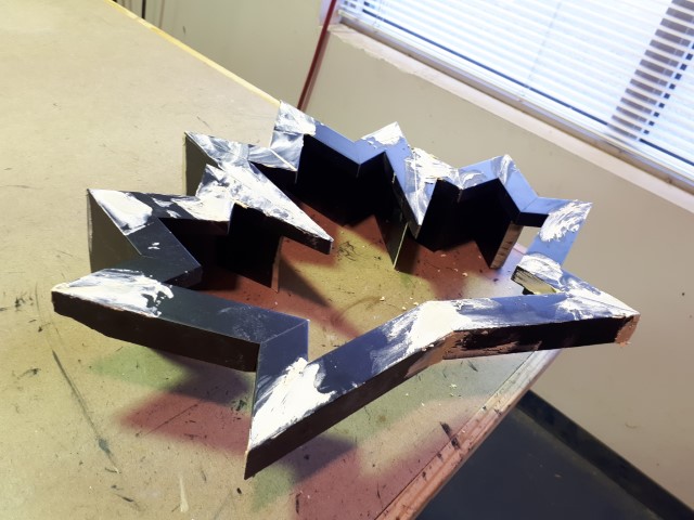
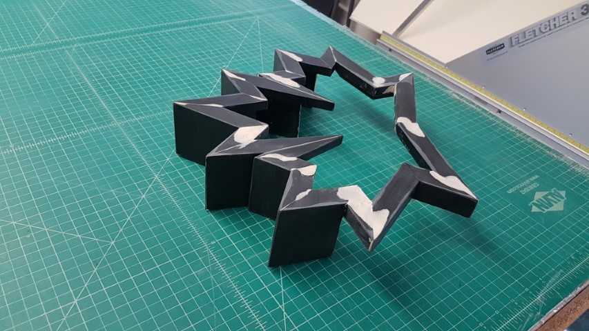
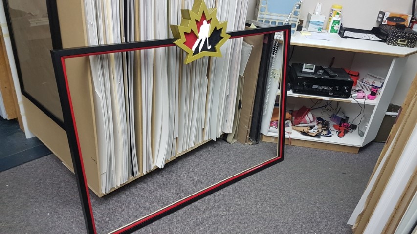
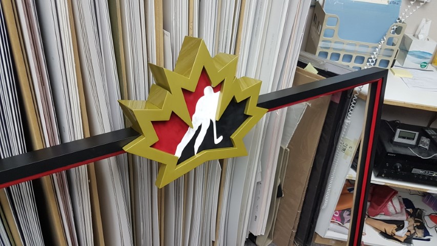
What a difference CUSTOM framing makes eh? These items were dropped off by another client who entrusts us with our creativity. We made a special frame of the Team Canada Logo and merged it into the large one. Some custom printed matboard to match the jersey pattern (which is really cool) and a lot of Candian Red – oh ya – also a custom Gold Ice matboard as well – just to let everyone know they won the gold!!!

Here are a few pics of the progress and the FINAL RESULTS!!!

Enjoy the view…

Free Newsletter Offer:

Want to receive our blog content as soon as we release it? Fill in this Form for to receive it in our free monthly newsletter!
8 + 1 =

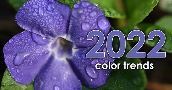
COLOR TRENDS 2022

COLOR TRENDS 2022

FRESH NEW YEAR FRESH COLOR PALETTE

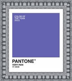
For over 20 years Pantone has determined a ‘Color of the Year’ based on design trends, socio economic conditions and our global culture. This year, for the first time, a new color was created to reflect the challenging, changing times we are all going through. Drum roll, please…

Color Trends Pantone

Introducing Very Peri!


How do you describe Very Peri? It’s a dynamic blue with violet-red undertones. Pantone describes it as blending the faithfulness and constancy of blue with the energy and excitement of red.

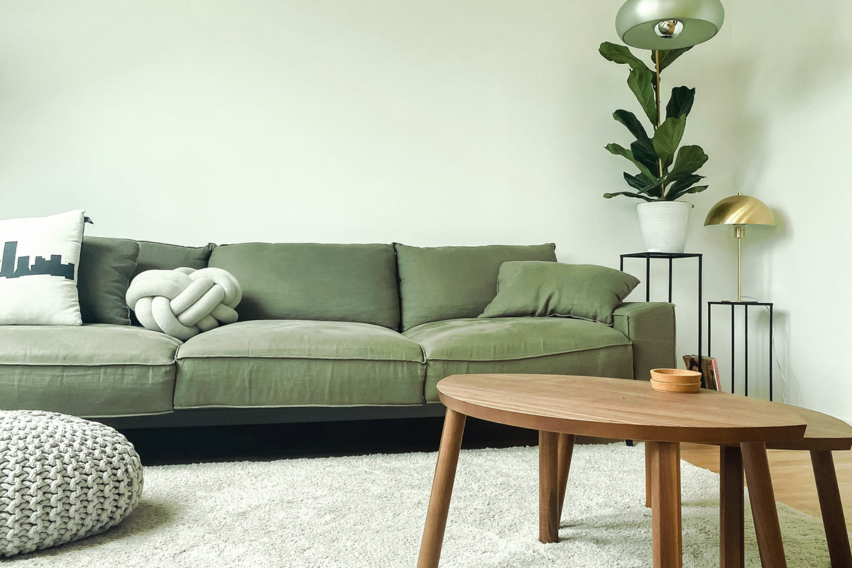
While Pantone concentrates on an all encompassing color trend, paint companies who determine ‘Colors of the Year’ use the same criteria geared towards home interiors. Playing on last years ‘calm me down and help me feel secure’ colors, it’s unanimous! Green is THE home décor color of 2022! Green is a calming color and represents regrowth. With that in mind, let’s look at colors the major paint companies say will be everywhere next year.

Color Trends Pantone

Guacamole by Glidden

Just like our favorite appetizer, Guacamole is relaxing and refreshing. It brings an organic energy to any space.

Color Trends Pantone

Olive Sprig by PPG

This is a crisp, earthy color that mimics nature’s resiliency and can blend into any environment.

Color Trends Pantone

Breezeway by Behr

Like a breath of fresh air, Breezeway is a cool, peaceful color tone that provides a feeling of renewal and healing.

Color Trends Pantone

Evergreen Fog by Sherwin-Williams

Combine green and gray with a hint of blue and you get a versatile and calming hue. It’s simple and sophisticated.

Color Trends Pantone

October Mist by Benjamin Moore

October Mist is a muted shade of sage green that can carry a look without drawing too much attention to itself.

What will your room be wearing this year?

Very Peri could be an overall color if you are bold enough, but it will probably work best as an accent color. Muted greens can work as understated wall colors or accents.

What Palette Do You Pair Well With?

You’re a down to earth, calm person who enjoys a relaxing vibe. This palette combines Behr’s Breezeway with Rainy Afternoon, Snowbound, and Ultra Pure White. Pair it with warm silvers and light woods for a modern, cozy space.
__

You’re an earthy, natural person and you like anything organic. This is a perfect palette for you. Sherwin Williams pairs Evergreen Fog with Neutral Ground, Dried Edamame, and Ethereal White. Top it off with light colored woods like Maple.

Try This Trick
When you are visiting Disneyland or Disney World, have you noticed the trashcans or fences? No? That’s because they are painted ‘Go Away Green’. This proprietary paint color is actually several different shades depending on the area and what they are trying to conceal. Want to hide unsightly items in your yard? Try these paint shades:

Free Newsletter Offer:

 icon_truck

Want to receive our blog content as soon as we release it? Fill in this Form for to receive it in our free monthly newsletter!

14 + 3 =