enthusiasm or vigor; vivaciousness; liveliness; spirit
PANTONE 18-1750
FUN FACT:
The origins of the magenta shade can be traced back to the cochineal beetle, which produces red carmine dye, one of the most precious natural dyes. Image credit: Huge / Pantone
Art & Colour Consultations
Do you want advice on how to use colour in your home? It can be overwhelming to put a colour scheme together. We can help! Our design experts will help you pick out colours that match your space and style. We offer in home design consultations at your convenience. Call, come in, or email us to schedule an appointment
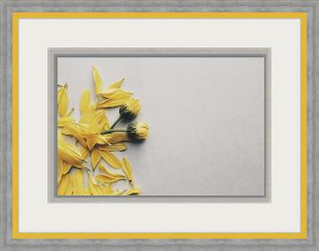
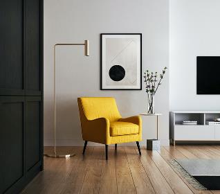
Using Viva Magenta in Your Home
Many of us have neutral coloured walls and furniture. It is safe, but sometimes can be a bit boring. Make a stand out statement with Viva Magenta! Neutral spaces often beg for a focal point something as simple as changing out sofa pillows with magenta ones might do the trick. What about a fabulous piece of magenta coloured art? Or a colourful chair? Or a floral arrangement? Or will you be daring and paint a single wall Viva Magenta for a dramatic look?
Last year greens were the IT colour, and many of us embraced them; they were a soft, soothing shade. Red and Green are complementary colours, so try pairing Viva Magenta with Valspar’s colour of the year, Green Trellis. The result will be a calm vibe, mixed with an energetic pop. Add polished silver hardware or frame and you’re set!
How are you going to use these colours this year??
We Can Help!
Colour Trends by the Century
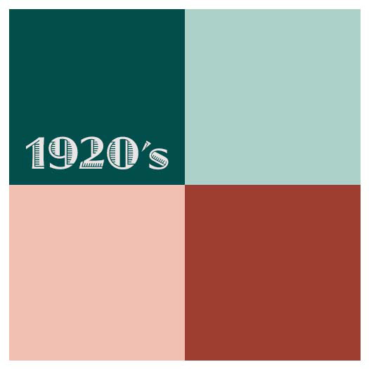
1920’s
The Roaring 20’s were a decade of indulgence. The walls were neutrals and accents were bright.
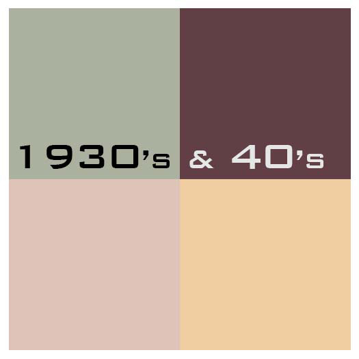
1930’s & 40’s
Smoky, dusty colours were the norm. Soft, subdued yellows, pinks, and hazy greens were accented with deep colours.
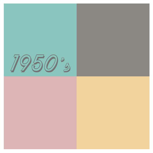
1950’s
Pastels ruled. They were even incorporated into appliances and bathroom fixtures.
1960’s
The ‘Peace, Love & Rock n’ Roll’ decade brought bright, clashing colours. Black & white were used to neutralize them.
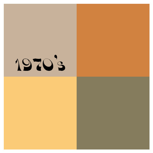
1970’s
Earthy colours dominate. Beige, rust, avocado, and harvest gold play together for a decade.
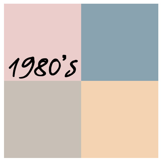
1980’s
Miami Vice and ‘country’ come together with mauves and blues. I bet you know a house that is decorated in those colours.
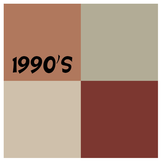
1990’s
A new take on earthy colours with a deeper, richer feel and Tuscan influences. Beige dominates, followed with terra cotta, sage and earthy reds.
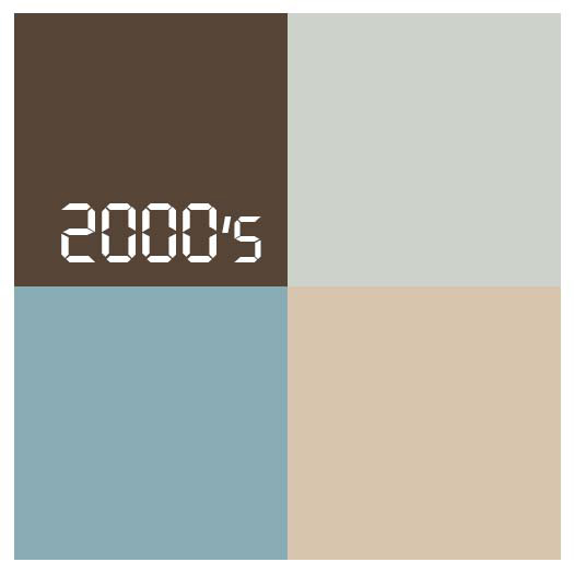
2000’s
Soft & Relaxing colours are popular to create a spa or coastal vacation feel in everyday life accentuated with pale blue and aqua paired with beige and white.
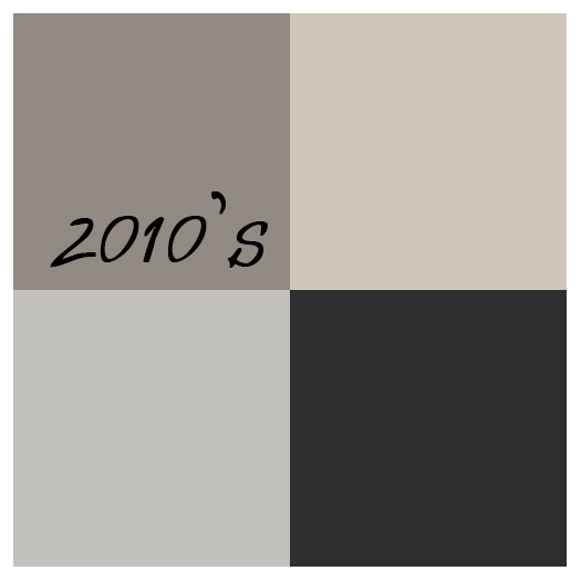
2010’s
Gray and any version of it is king! With the tech generation in full swing, gray was everywhere; paint, furniture, flooring, appliances, fixtures and, of course, laptops.
2020’s
Care to guess?????
Of all the amazing Colour Trends for the last 100 years…. ….which decade do you like best?
Free Newsletter Offer:
icon_truck Want to receive our blog content as soon as we release it? Fill in this Form for to receive it in our free monthly newsletter!
Illuminating Yellow & Ultimate Gray are Colors of the Year!Everyone is looking for changes this year! It certainly has been a challenging time for everyone. We don’t know what this new year will bring, but many are ready for a change. With all the pressing uncertainty and unanswered questions, why should we concern ourselves with color right now? Because color reflects our mood. By changing the color around us, we can change our mood. We need comfort and hope. We need the soft, solid colors of familiarity – the caring, ‘we are all in this together,’ dependable color. We also need the happy colors of optimism that hint better things to come in the year ahead.
In-Home Color & Art Consultations
It can be overwhelming to put a color scheme together. We can help! Our design experts will help you pick out colors that match your space and style. Email, Call or Come in to find out how we can help you. Our staff is taking extra precautions to ensure we all stay safe. We sanitize our hands before entering your home, wear masks in your home, and maintain a 6’ distance. We will utilize technology as much as possible. Many companies make color predictions but this year their forecasts all have one thing in common: solid, soft neutrals paired with bold accents. The palettes are filled with comfort colors to promote a sense of calm and wellness.
A huge Thank You to our first responders, teachers, health care staff and countless others for being there for us. And Thank You, our wonderful customers, for supporting small businesses.
Using the Color Trends
What’s Trending
Look for Bold Color, Good Quality & Comfortable Minimalism
Deep, Bold Color has a stabilizing and comforting feel. A rich color can feel like a warm hug and have a feeling of elegance and sophistication. Look for the colors in paint, window and floor treatments and cabinet coloring. We can show you how to use these new colorings with matting and framing. Craftsmanship, Comfort & Durability is key for 2021. Look for furniture, fabrics, and accessories that will last, that are made with sustainable products, and that can be passed down through the generations. We have always prided ourselves on the quality of our frame mouldings so you can enjoy your framing for a lifetime. Soft Minimalist Design is here to stay. Organize your home with intentional, clutter-free spaces that make you feel calm. It’s about having less things, but the right things. More relaxed, casual, comfortable minimalism allows for an escape, with a feel of innocence and whimsy. You will see colors and patterns that make you smile. Now’s the time to frame a playful piece that will make you happy every time you look at it. We’ve all spent much more time in our homes recently – plenty of time to notice how our rooms need new color! How can we use these color trends to update our homes?
Recent Projects:
Brian @ workLots of Fun
Free Newsletter Offer:
Want to receive our blog content as soon as we release it? Fill in this Form for to receive it in our free monthly newsletter!